A CASE STUDY
H-Smart
Industry
Healthcare
Client
Service
Research · UX · UI System
Timeline
April 2025 - May 2025
01 — OVERVIEW
One platform. Every workflow.
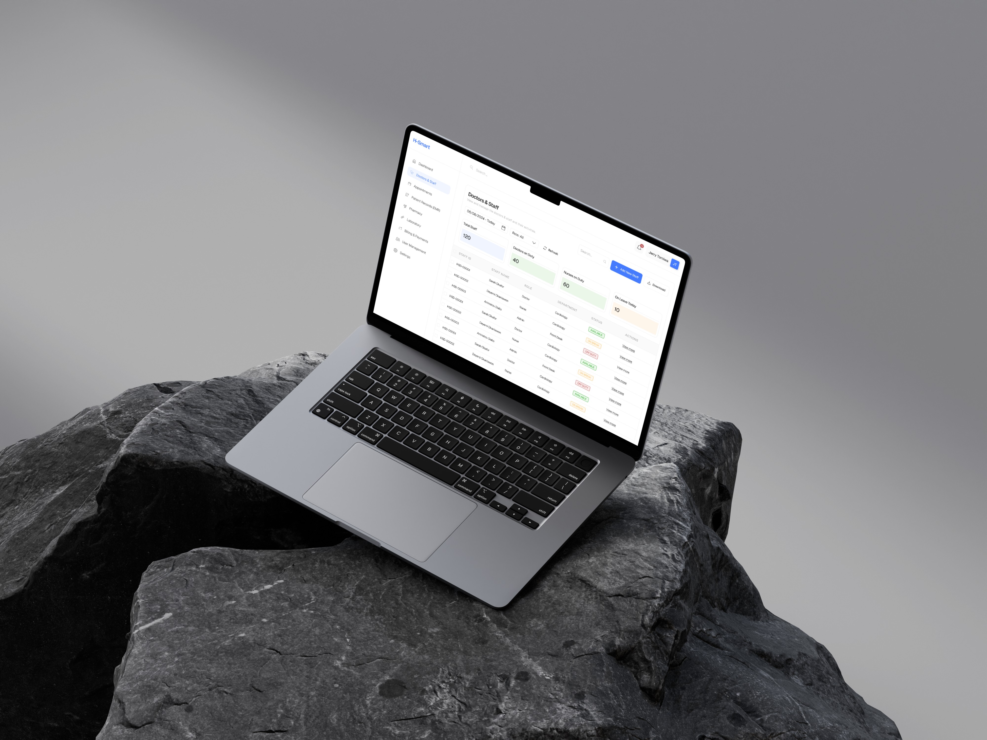
H-Smart is an AI-powered Hospital Management System designed to bring the full breadth of hospital operations under a single, coherent interface. From doctor scheduling and electronic medical records to billing, pharmacy, and lab automation — it eliminates the friction of switching between disconnected systems and empowers both clinical and administrative staff to focus on what actually matters: patient care.
"Hospitals shouldn't have to choose between powerful software and software people can actually use."
02 — THE PROBLEM
Fragmentation was costing hospitals more than time.
Before H-Smart, most hospital staff juggled three to five separate tools just to complete a single patient interaction — a scheduling system that didn't talk to the EMR, billing handled separately from pharmacy, lab results living in yet another portal. Each handoff was a potential failure point.
The consequences were real: delayed discharges, billing errors, duplicate data entry, and clinical staff spending more time navigating software than caring for patients. The problem wasn't a lack of tools — it was a lack of connection between them.
Fragmented systems
Staff switched between multiple platforms per workflow, scheduling, EMR, billing, pharmacy, and lab were entirely siloed, with no shared data layer.
Manual, error-prone processes
Reliance on paper-based or spreadsheet workflows introduced transcription errors, lost records, and unnecessary delays in patient treatment.
Poor visibility for administrators
No single source of truth for hospital operations. Decision-makers couldn't act on real-time data because data was scattered across systems.
Steep learning curves
Each tool had its own logic and interface. Onboarding new staff was slow, inconsistent, and costly across departments.
03 — RESEARCH & DISCOVERY
Understanding the people behind the processes.
I began with workflow mapping across the core hospital roles — doctors, nurses, administrators, pharmacists, and lab technicians. The goal wasn't just to understand what tasks each role performed, but where the pain lived: where did people stop, backtrack, duplicate effort, or make workaround decisions?
Insights from this research shaped every major design decision that followed. Three themes emerged consistently across all roles.
1
04 — DESIGN APPROACH
A single source of truth, designed for speed.
With research grounding every decision, I moved into information architecture — mapping how the platform's modules would connect and share data, and defining a navigation model that surfaced the right information based on who was logged in and what they were doing.
The core design principles guiding every screen:
Each user type — clinician, admin, pharmacist — sees only what's relevant to them. Reduced cognitive load, faster task completion.
Summary data is always visible at a glance. Detail is available on demand. No screen tries to show everything at once.
Errors caught early
Inline validation, AI-flagged anomalies, and confirmation prompts for high-stakes actions prevent errors before they happen.
Data-heavy screens use structured density without clutter — clear hierarchy, intentional whitespace, and scannable layouts.
Density that breathes
05 — KEY SCREENS
Six modules. One coherent system.
Each module was designed independently but built on shared components, so the experience feels unified regardless of where a user is in the system.
1
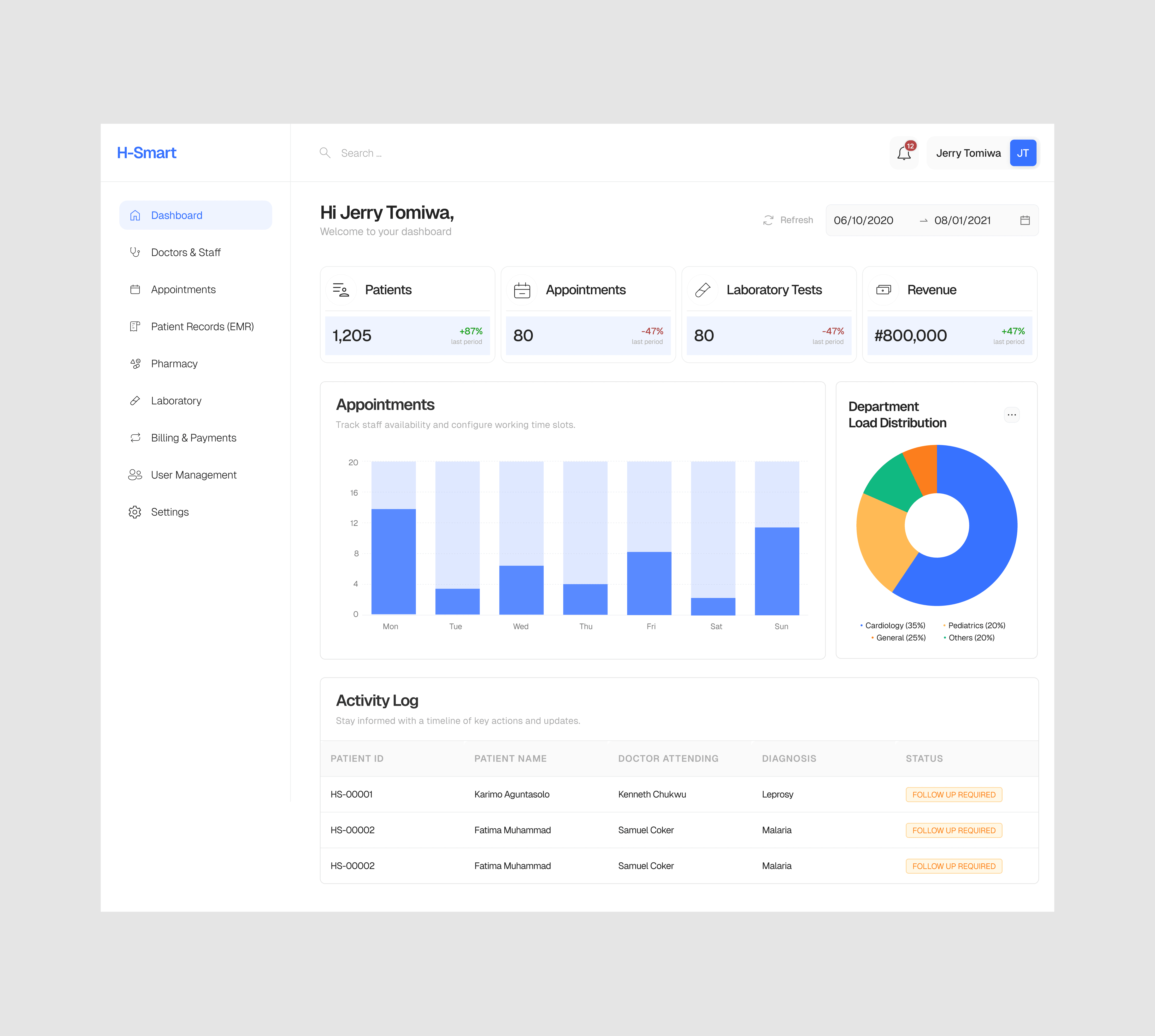
Admin Dashboard
A command centre for hospital operations — real-time occupancy, staff status, appointment load, and billing summaries all visible at a glance. Designed for the decision-maker who needs to act fast without digging.
2
Doctor & Staff Management
Scheduling, shift management, and profile management in one place. Conflict detection flags overlapping schedules automatically, and shift changes propagate across the system without manual updates.
3
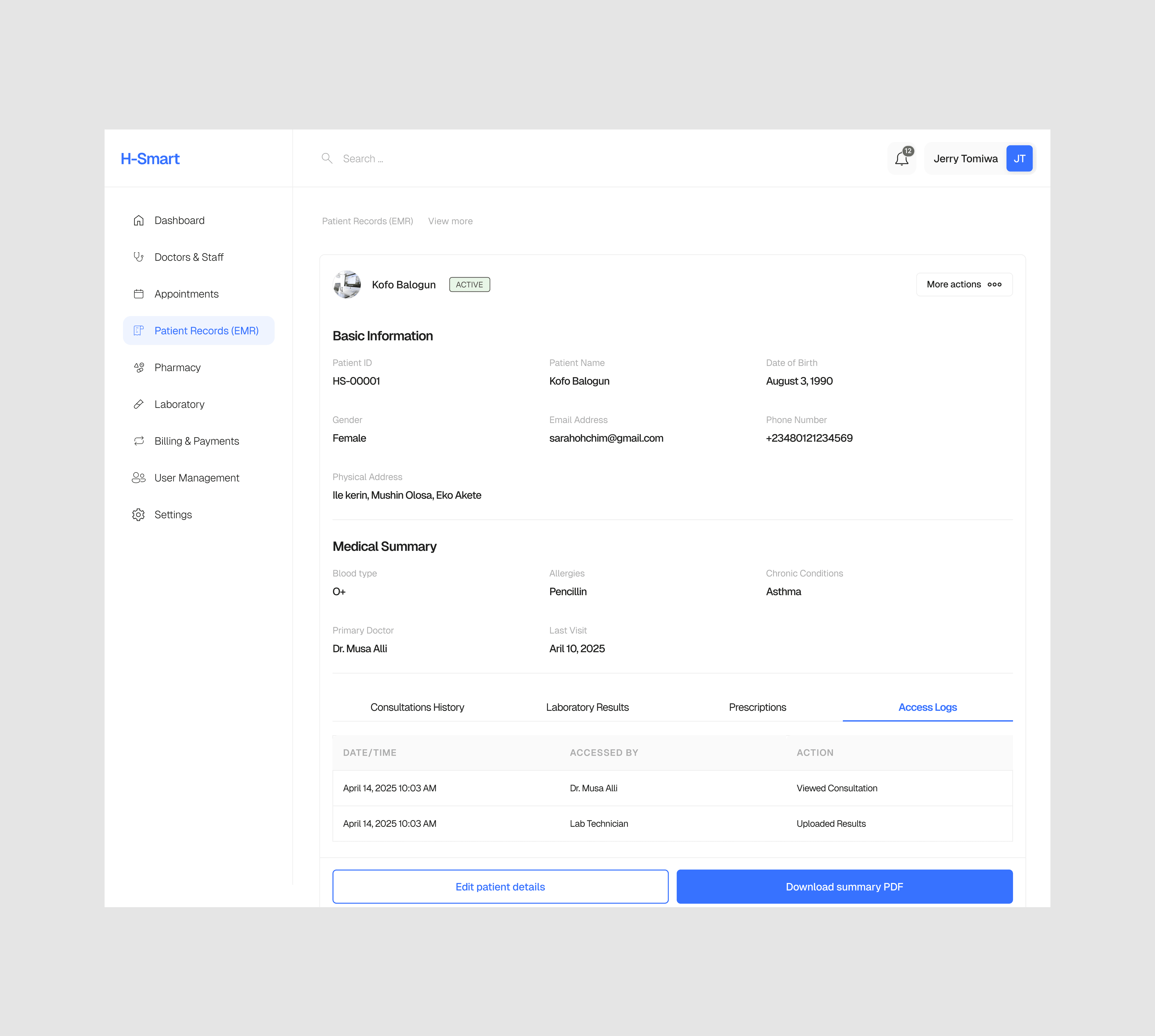
Patient Records (EMR)
A clean, structured view of every patient interaction — diagnosis history, medications, allergies, and lab results — all on one screen. Designed with the clinician's reading pattern in mind: most critical info first, history expandable below.
4
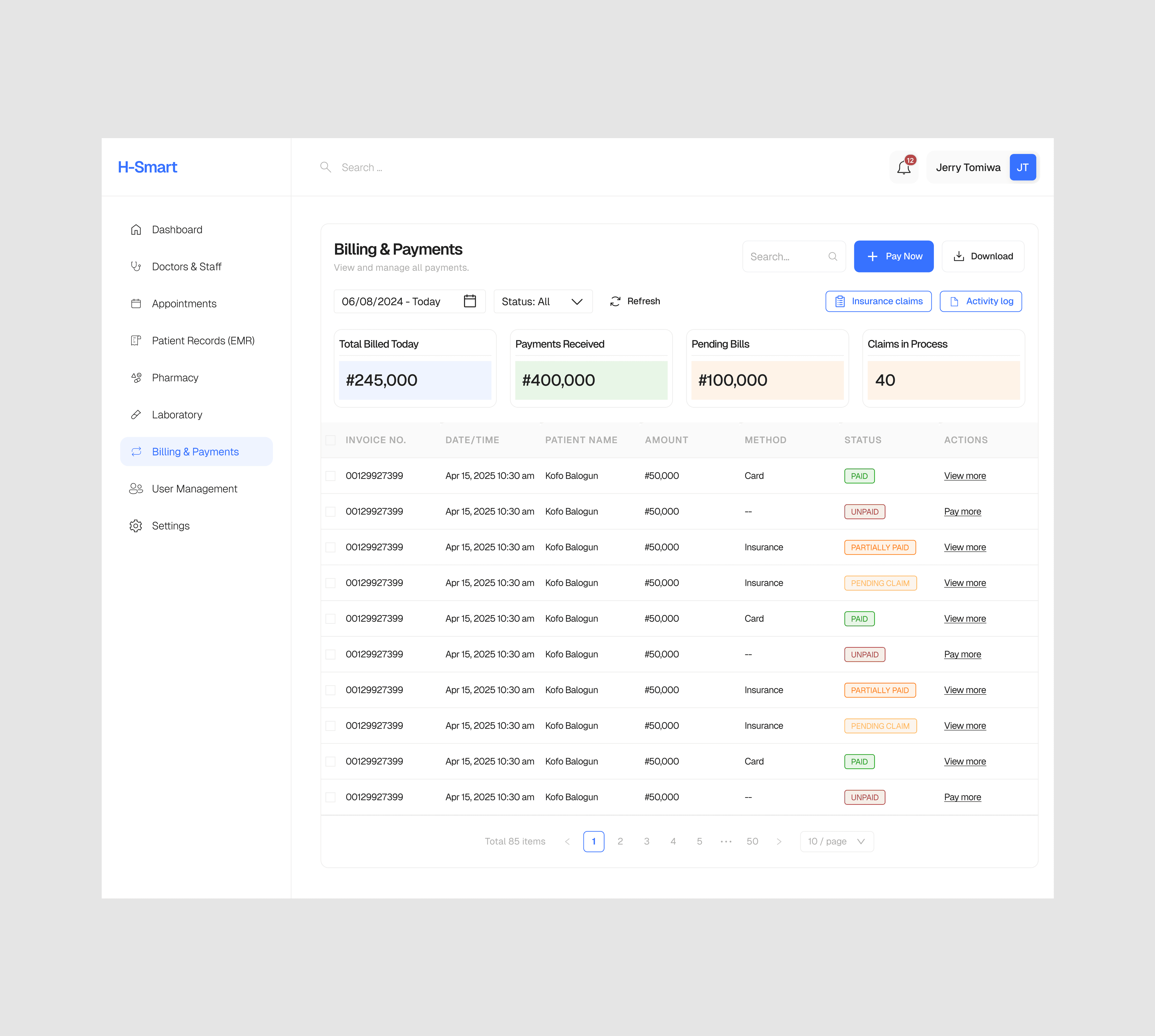
Billing & Payments
Auto-generated invoices from clinical activity reduce manual billing work by a significant margin. Payment status, insurance claims, and outstanding balances are tracked in a single view with filterable status columns.
5
Pharmacy Management
Prescription requests flow directly from the EMR to the pharmacy queue. Stock alerts, dispensing logs, and expiry tracking are built into the module so pharmacists maintain full visibility without leaving their workflow.
6
Lab Automation
Test requests, sample tracking, and results delivery are linked end-to-end. Clinicians receive lab results directly in the patient record — no separate login, no waiting for a printout.
06 — DESIGN SYSTEM
A language built for clinical environments.
H-Smart's design system was built to serve a demanding use case — high-density data, stress environments, and users who need to trust every piece of information on screen. The visual language reflects that: clean without being cold, structured without being rigid.
Component library in Figma
Role-based colour coding
Accessible contrast ratios
8pt spacing grid
Shared navigation patterns
Shared navigation patterns
Status & alert system
Data table components
Form validation states
07 — OUTCOMES
A system that works as hard as the people using it.
The H-Smart design delivered a fully realised product concept — from research through to a working Figma prototype spanning all six core modules. The result is a platform that doesn't just centralise hospital operations; it actively reduces the cognitive burden on the people running them.
6
Unified data layer replacing siloed systems
1
Fewer context switches per clinical workflow
-
08 — REFLECTION
What I learned
Designing for healthcare reminded me that the stakes of UX decisions are rarely higher. Every ambiguous label, every extra click, every poorly sequenced form is not just a usability problem — it's a risk to patient outcomes. That kept me rigorous in ways that other domains don't always demand.
The biggest challenge was balancing completeness with clarity. Hospital workflows are genuinely complex, and there was a constant temptation to surface more data, add more options, show more context. The discipline was in knowing what to hold back — and trusting that a clean, fast interface delivers more value than a comprehensive but overwhelming one.
I also deepened my appreciation for systems thinking in design. When every module shares a component library and a data model, decisions made in one screen ripple across the whole product. That responsibility shaped how I approached every component from the start.